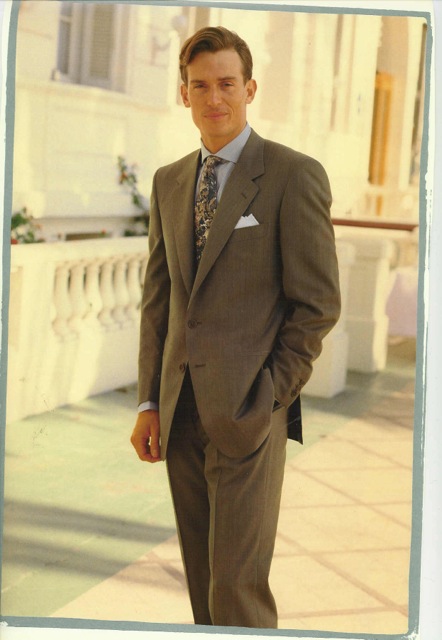
 When composing an image, graphic designers use a few well-known principles to ensure their art is appealing to the eye. Gentlemen can apply those same timeless principles to the art of dressing.
Rule of Thirds:
Most designers avoid placing the focal point in the exact middle or right on an edge of the image. Instead, it’s placed about a third of the way in from an edge. When wearing a suit, the hem of the coat should reach well below the halfway point to avoid visually cutting your frame in half.
Avoiding Fragments:
When a design element extends beyond the edge of the image, distracting visual fragments can be formed. Designers enlarge the fragment to avoid jarring the eye. Ensure your collar and shirt cuffs extend an appropriate length past your coat to keep from creating small visual fragments in your outfit.
Remember, you are an image to those who see you, and considering the visual design of that image is always important.

